Tuesday, 14 December 2010

DMG 110 - Final Nursery School Site

                                                            Beanstalks daycare centre

And FINALLY, my finished web site, which overall I'm pretty pleased with, however i would  have liked to make a few tweeks. Such as not putting the fact that its for a daycare centre in the heading and also i would have added some photos of staff and children and some flash graphics also.

The positive points are, I think it demonstrates the concept of growth and change well, and also looks quite friendly yet informative. Another theme which I was trying to work towards, is that of children's stories / nursery rhymes, hence the name. The font used is called Green Piloww (not a spelling mistake, thats how it's spelt), and as usual its from Dafont.com

DMG 110 - Task 5 - Flash Graphics Banner

              http://slab.sunderland.ac.uk/~bf88zn/task_5/Task 5 - Flash Graphics/Graphicsbanners/Task5.swf

For my graphics banner, I made 10 different photos of children, based around the idea that parents take more photos of their children than any thing else, then to create the effect of them falling onto a surface, I used shape tween to first make them large then getting smaller as the scene progressed. Then i simply added another photo on another layer every  20 frames.

DMG 110 - Task 4 - Flash Typography Banners

                                                              Typography banner 1

This flash banner has been inspired by the concept of my final nursery school, which is growth and development. The name suggests young plants, as children are young people. The font used is called Leaf1, and is again taken from Dafont.com


                                                                 Typography banner 2

This banner was basically me experimenting with some of the flash functions, namely motion tween and playing around with the Alpha values to make the letters appear and disappear as the letters bounce around the stage.


                                                               Typography banner 3

Next is a slightly more refined experiment, for this i decided to make the stage black to emphasise the colour of the red box, i think this is the best of the 3 banners, although i don't think it would work as a banner for a nursery school.

DMG 110 - Task 3 - Navigation Bar Designs

                            http://slab.sunderland.ac.uk/~bf88zn/task_3/Task 3 - Navagation Bars/nav.html


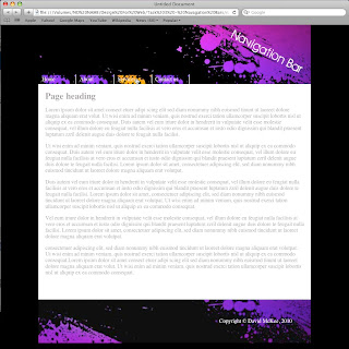
This is my roll over navigation bar design, for this i simply changed the hue & saturation of my header / footer design 3, and used a sample of the background (which i again changed the hue & saturation, to make Orange) as the roll over image.

I think the final design is ok, but it could have been better.

DMG 110 - Task 2 - Header & Footer Designs

                                                               Header footer design 1
For my first header design i wanted to do something which would catch the eye, so i used a neon light tube along with a font which has a techno feel to it. Over all I'm not particularly happy with it, as i think it's too garish.


                                                               Header footer design 2
The second header design represents the long road i've taken to get her, being a mature student. the font used is called iArnold and is from Dafont.com 


                                                                 header footer design 3

My final design has been inspired by my love of painting, the font used is called Birth of a hero, which i think works quite well with the background image. The font has also been taken from Dafont.

Thursday, 30 September 2010

Task 1 - Analysis & Review

For my first website I decided to keep the search local, and I had to look no further than a local graphic design company called, Element 5.0.
This site is, as you would expect from a design company very stylish, contemporary and eye catching. The colours work really well together giving it a modern yet retro feel, however its the logo design which stands out most. Also the navigation is easy to find and most importantly very simple to use.


Below is for another local company based in Gateshead,which specialise in game & mobile phone applications.
I think this site is visually very diferent from my previous choice. As the company logo is at the top of the page rather than at the side, as is the navigation bar. I think the logo is really well designed which is in keeping with the rest of the site. Another notable difference is that there is more company information on the home page which I think is useful, especially since another site exists with the same name, however, it is " dedicated to serving Jesus Christ through the development of software and internet related services".


                                                         http://www.gospelware.co.uk/


Next up,was found via another site http://101bestwebsites.com/ which strangely, wouldn't make it's own list. The Value Engineers are a branding and marketing company, and judging by their own site, are at the top of their game, having worked for some of the worlds leading brands.
It has everything that makes you want to explore a site further. Its home page is very bold making use of a Black background, coupled with contrasting colours, Yellow, Blue & Pink which seems to be very "of the moment".
The functionality of the site itself is very user friendly, and although it contains a lot of information the layout makes it easy to read and easy to find your way around.


                                                       http://www.thevalueengineers.com/


Sensi Soft are a software and advertising solutions company. Their site is one of the best iv'e ever seen, it makes you want to investigate and look at all the content pages, even when you don't need too. 
Every page is different starting off in what looks like Victorian England, moving through 1940's America to a modern day Japan using Flash to simulate a spinning  time warp effect. It also includes music and sound effects which enhance the whole experience.
The layout and navigation is like the rest of the site, which in a word is stunning!! The screen shot below doesn't do it justice. Check this out!!


                                                             http://www.sensisoft.com/


Finally, but by no means least Platfuse is a I.T framework company. This site is amazingly technical and like Sensi Soft's above, makes you want to play around and explore every element. Which ties in with the whole feel of the site, which is very like a futuristic computer game or a display screen which wouldn't be out of place on board a 22nd Century space ship. 
The only down side is that there is so much information that the text size is a bit to small to be truly user friendly.....However, It comes as no surprise that Platfuse made the Indesiner list of best flash sites 2009. And like the site above needs to be thourghly explored to gage just how good it really is!!


                                                         http://www.platfuse.com/main/